


 Shopware Agency
 Shopify Agency
 JTL SHOP 5 Agency
 Gambio Agency
 Magento Agency
 WooCommerce Agency
 PrestaShop Agency
 Xentral Service Partner Enterprice
 VARIO Service Partner
 Odoo Agency
 Amazon Agency
 eBay SEO
 Otto SEO
 Google SEO
 Google Ads
 Social Media
 Facebook Ads Agency
 Instagram Ads Agency
 ChatGPT Agency
 Link Building Agency


 Ecommerce Tutorials
 eCommerce Podcast
 SEO Tools
 AI Tools
 eCommerce Facebook Group
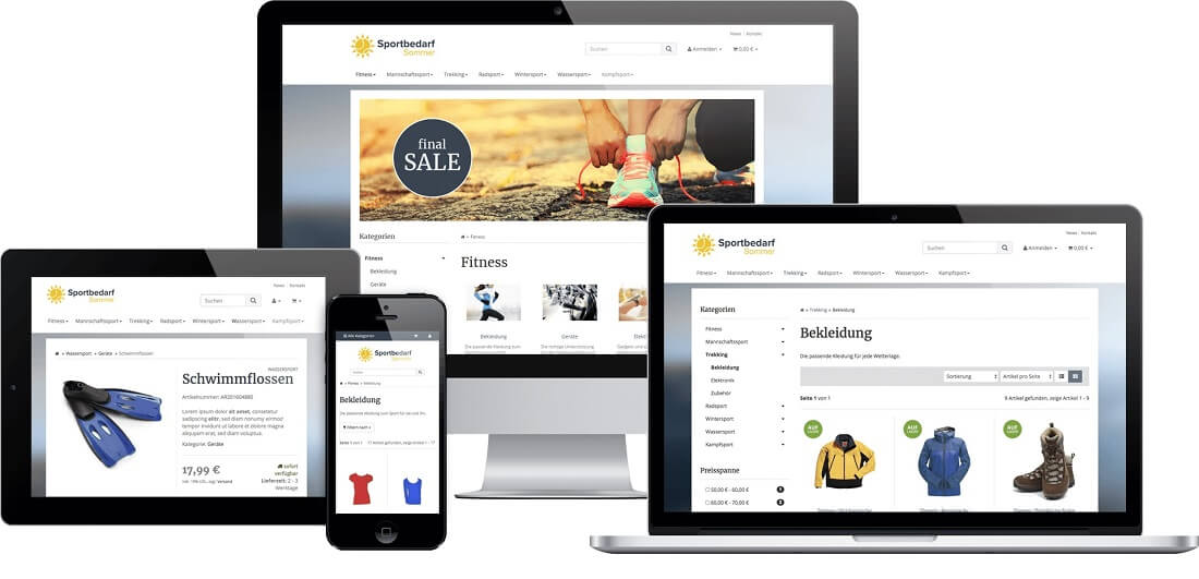
Responsive JTL Shop Template
Mobile Friendly E-Commerce
Today, hardly any store goes online without responsive designs. Google has launched a “mobile first” campaign that prioritizes mobile-optimized websites. From September 2020, websites that are not mobile-optimized will even be penalized with poor rankings.
Online stores that we create for our clients all have a responsive design. Find out exactly what it is and how it can help your customers here.
What is responsive design?
Whereas in the past all Internet visits were made only on computers, the proportion of mobile users is growing steadily. Websites and stores in the old design are therefore no longer up to date. A good online store has to prove itself on many different end devices, otherwise the customer will be gone. Many purchases are now made in the evening. The customer sees an advertisement, grabs his tablet because he wants to learn more – and in the best case lands on your store.
Therefore, this should also be mobile-optimized, use a different font and display images below each other rather than side by side.
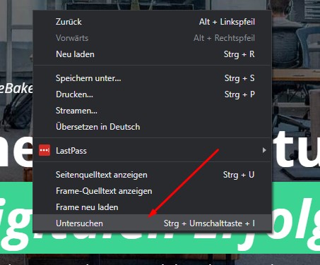
So a designer doesn’t just have to worry about how the store looks on their big screen. Mobile optimization is always performed as well. For this purpose, web pages can also be simulated in modern browsers such as Google Chrome. If you already have a store, check it out on a smaller device.
In Chrome, simply right-click in the middle of the store, then click “Examine”.
After that, you have a choice of different smartphones and tablets above:
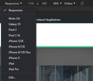
Select an end device here or drag the browser to a different size. Your website should now adjust. If it doesn’t, you should choose a new design.
Responsive design in JTL store 4
With JTL-Shop 4, the EVO design is included as standard. This design is already responsive, but should be customized to your needs. Our designers will gladly take care of this and also work the design into your store. With this, you’ll be ready for Google’s “mobile first” campaign.
Of course, as a JTL service partner, we can also create a completely new design for you. This should then be based on your corporate identity. Why not arrange a free consultation right now and let us plan your future.


