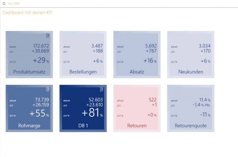
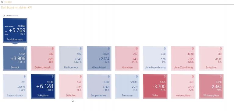
![DataWow Dashboard – The most important KPI’s at a glance [Werbung]](https://ebakery.de/wp-content/uploads/2021/01/datawow-dashboard.jpg "DataWow Dashboard – The most important KPI’s at a glance [Werbung]")

Related Posts

DEIN-SPORTSFREUND.DE
"Dank dem beherzten Eingreifen von eBakery und deren routiniertem Umgang mit der JTL Wawi konnte man uns schnell und unbürokratisch weiterhelfen. Mein besonderer Dank geht an den Mitarbeiter Benjamin Lambrecht, der seinen Samstag Abend für unseren Shop aufgebracht hat und das dringende Problem zügig löste."

AUST24.SHOP
"Wir sind begeistert von der Lösungsorientierten und pragmatischen Gangart, der extrem hohen Leistungsbereitschaft und Verfügbarkeit sowie dem persönlichen wie professionellem Vorgehen des gesamten eBakery Teams!"

HAUSHALTSPARADIES.DE
"Wir fühlten uns von Anfang an gut durch eBakery beraten. Durch den Einsatz der JTL Produktpalette verfügen wir nun über ein hervorragendes Onlineshopsystem, welches modular erweiterbar ist und verschiedene Marktplatzanbindungen ermöglicht. Zudem gibt uns unsere Multichannel Strategie zusätzliche Umsatzsicherheit in der aktuellen Krise."

tischdeko-shop.de
"Wir haben uns für eBakery als JTL Servicepartner entschieden, da man hier über viele Jahre Erfahrung in genau diesem Spezialgebiet verfügt. Unser Shop und die Auftragsabwicklung laufen sehr stabil. Mein besonderer Dank geht an Mohamed Ali Oukassi, der sich persönlich um die JTL-Wawi Einrichtung gekümmert hat."

UNICAT CANDY
"Wir hatten es eilig mit der Überarbeiteten Version unseres Food-Shops an den Start zu gehen und den deutschen Markt zu erreichen. Wir sind froh, dass wir mit eBakery einen Partner gefunden haben, der uns eine derartig schnelle und zugleich professionelle Lösung unserer Herausforderung ermöglicht hat."
FEIN-GEIST
"Wir hatten es eilig mit der Überarbeiteten Version unseres Food-Shops an den Start zu gehen und den deutschen Markt zu erreichen. Wir sind froh, dass wir mit eBakery einen Partner gefunden haben, der uns eine derartig schnelle und zugleich professionelle Lösung unserer Herausforderung ermöglicht hat."

WASCHGURU.DE
"Die Zusammenarbeit mit eBakery war unkompliziert und hat letztlich schnell zum Ziel geführt. Ich wusste prinzipiell was ich haben möchte, nur wie ich den Webshop am besten umsetzen kann, war mir nicht klar. eBakery hat mir dann verschiedene Optionen aufgezeigt und schließlich hat mich der JTL-Shop als Ergebnis überzeugt."

SMOKE2U.DE
"Das Team von eBakery hat uns von Anfang an auf professionelle Art und Weise unterstützt. Mit unserem breit aufgestellten JTL Onlineshop, verfügen wir nun über eine optimale Ergänzung zu unserem Filialnetz und sehen uns für die Zukunft gerüstet. Insbesondere in der aktuellen Corona-Krise, können wir von der Lösung bereits erheblich profitieren."